|
Yet More Fun With Graphics
Richard L. Howey, Wyoming, USA |
In this installment, I want to look at some of the more eccentric functions in my graphics program (PhotoImpact Pro 13), but which are, nonetheless, useful and interesting.
We’ll begin with a function which allows you to compare 2 or more images by “stitching” them, so that you can view both and play optometrist: “Which image is better? Image 1 or Image 2? Again, Image 1 or Image 2?”
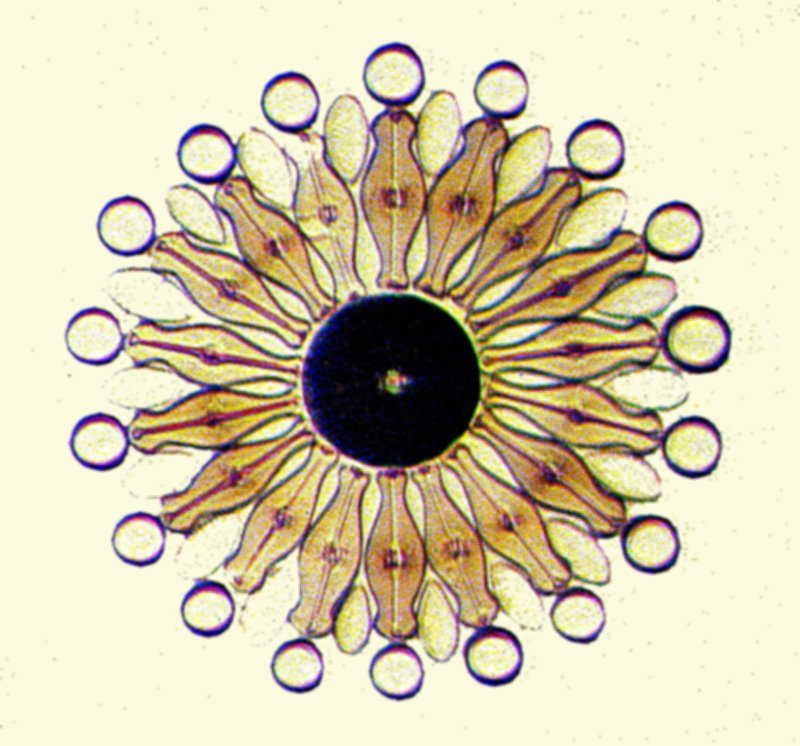
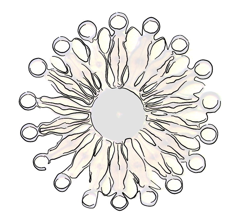
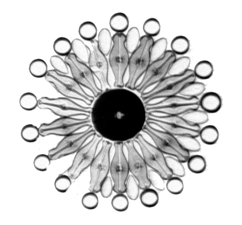
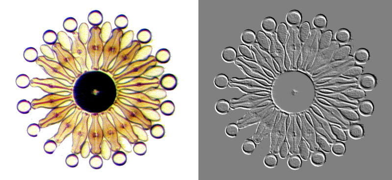
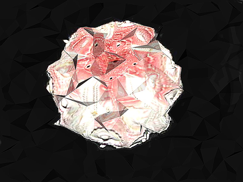
Let’s start with a diatom arrangement by Klaus Kemp. First the image and then we’ll start to play with it.
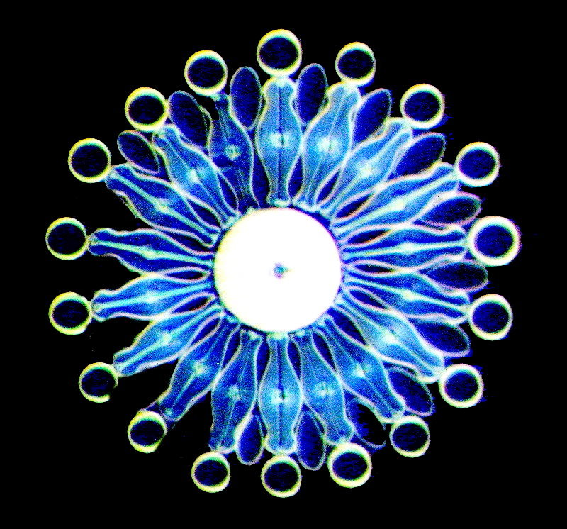
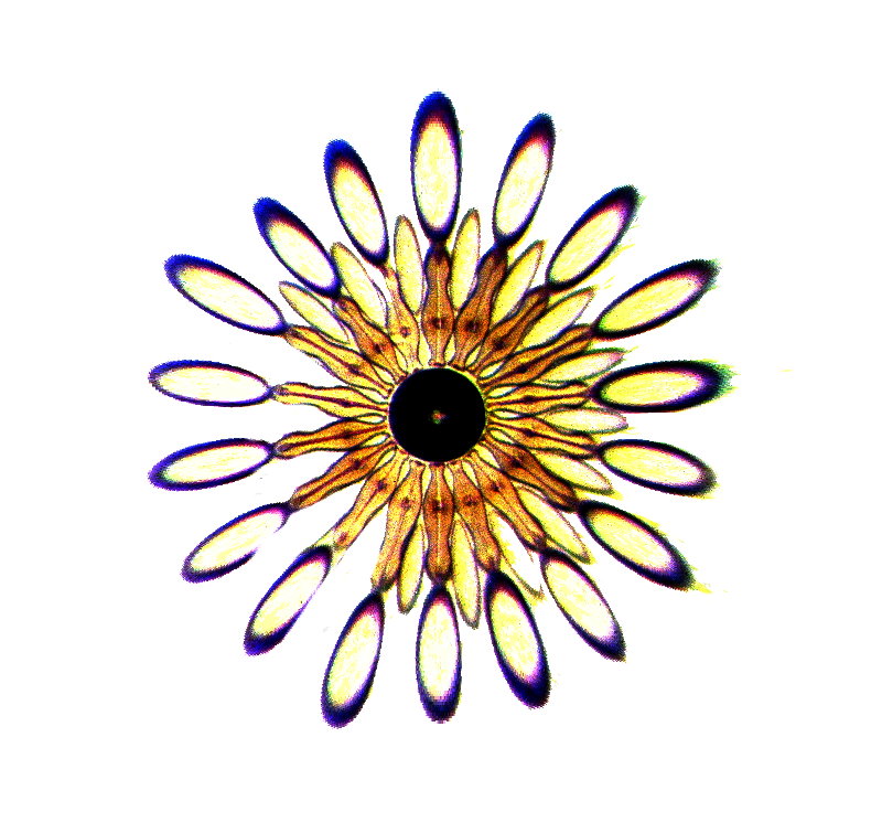
Next, let’s take this image and use the “INVERSE” function on it. The result is quite attractive.
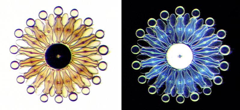
If we want to compare to decide which we like best and wish to incorporate in a publication, then we can apply the “Stitch” function with the following result. Note that the individual images comprising the stitched image are smaller.
Let’s expand the discussion a bit and look at some other functions and we’ll return to stitching a bit later. We’ll keep the same diatom image and apply a series of modifications to it, beginning with the “Brick Tiles” function under “Artistic” effects.
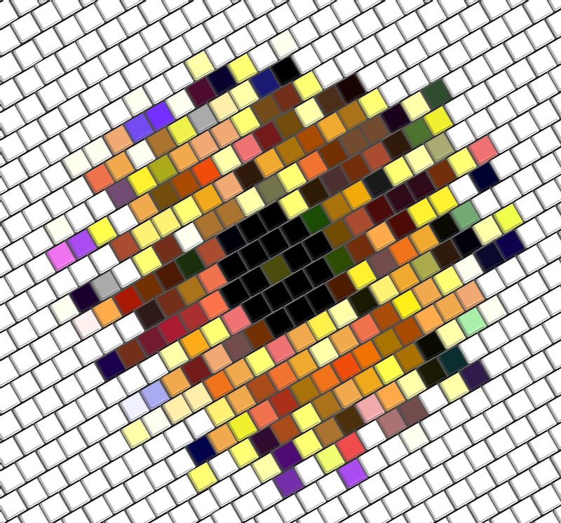
The diatom is no longer immediately recognizable, but the effect is pleasantly colorful and would make a nice tiled top for an end table.
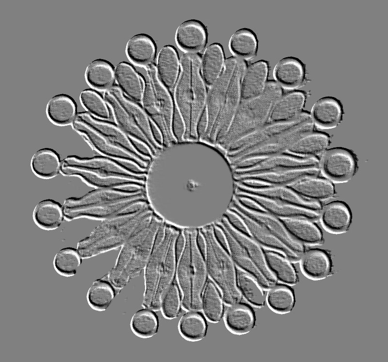
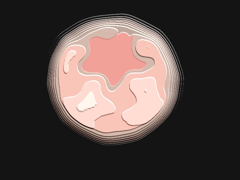
Next up is the “Contour Drawing” function which presents us with a sort of map of the outlines of the image.
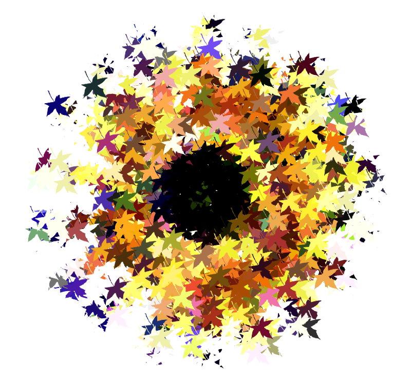
We continue with “Decoupage” and we get an image that looks as though it were composed of brightly colored leaves.
If we “Emboss” the image, we get a result that might be found on an ancient wall or a slab of mud.
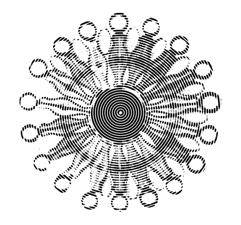
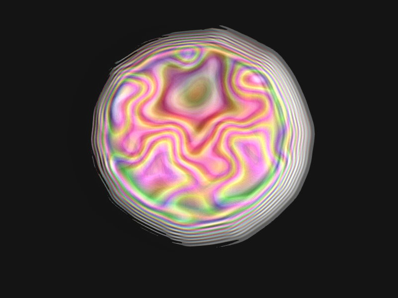
Or we can get a rather dizzying, Spirograph-like affect with the application of the “Engraving” function.
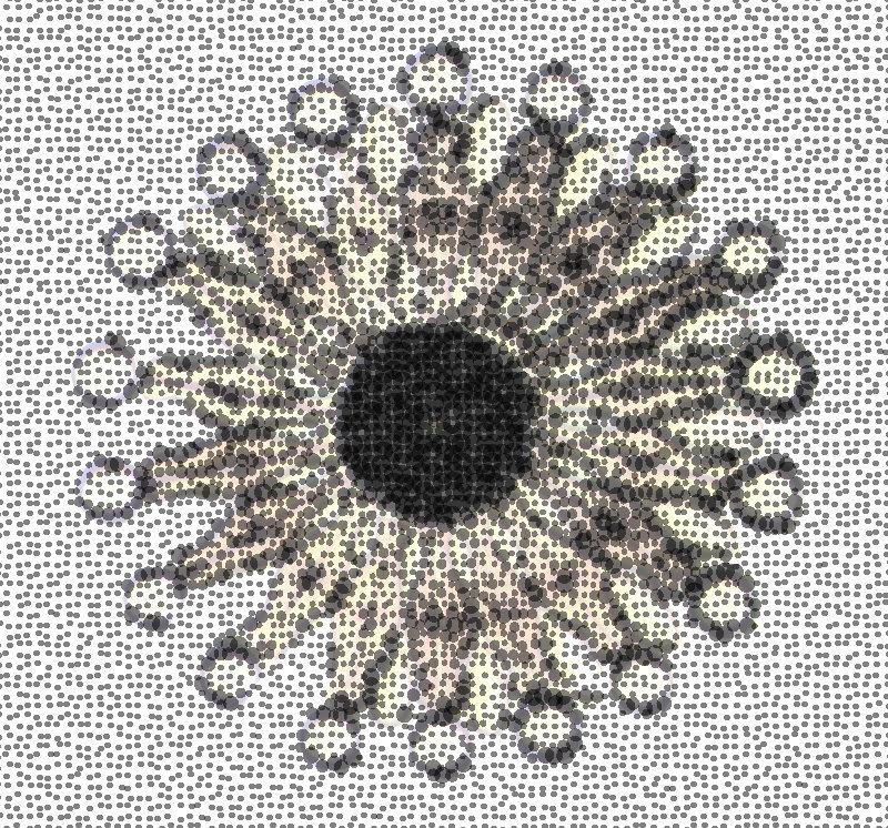
With “Half-tone”, we get an image that looks as though it had been stitched into a rough piece of fabric.
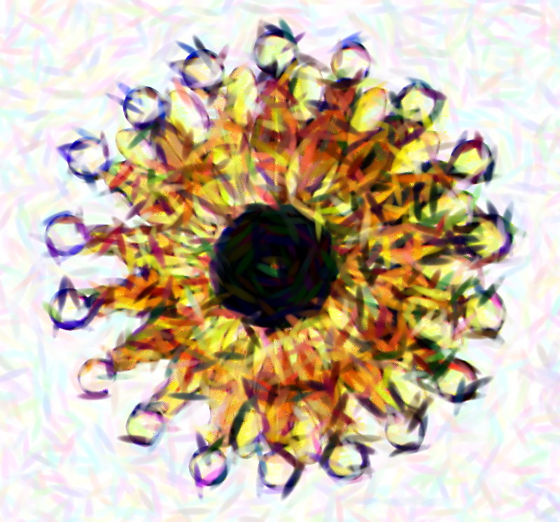
Next up, we have an “Impressionist” version of the diatom which might forgivably be thought to be a child’s finger painting.
What would happen if we bleach the image? Well, we might end up with this “Monochrome”.
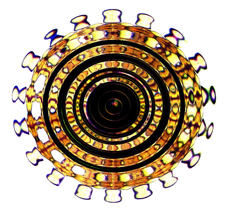
There is also a strange function called “Pinch” and in this particular version the diatoms have been transformed so that they look like a series of juggling pins.
Also, we have the “Ripple” function (not the so-called wine the effect of which would be very, very different). This looks rather like an aerial view of an area, perhaps an ancient coliseum.
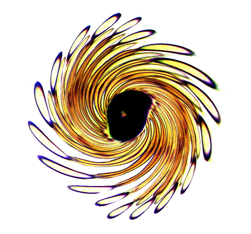
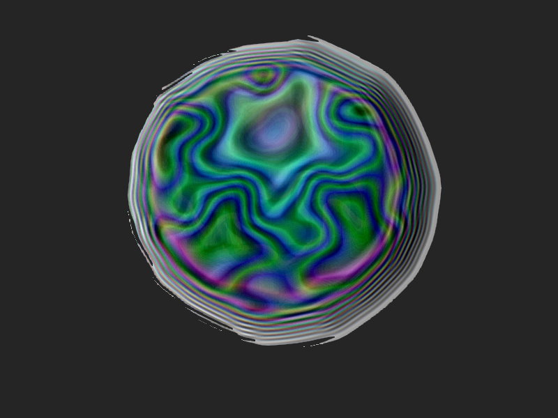
And here’s what our diatom arrangement might look like if it got caught in a whirlpool.
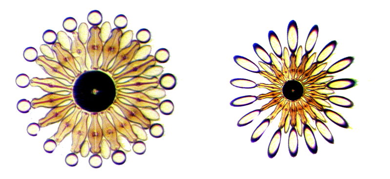
I said earlier that we would return to stitching and this is a good time to use that function to compare some of the modifications above to the original. We’ll begin with a comparison to “Pinch”. The side by side format gives us an idea of how the function has altered the original image.
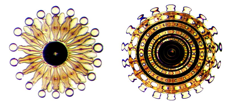
Next, let’s compare the original with the Ripple effect.
A dramatic comparison displays itself in relation to the Emboss function.
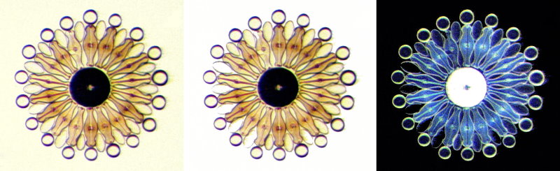
And a last comparison, this time showing 3 images, the left one being a modification with a slight alteration of the background color, the central one is the original image, and the right one is the inverse image. Note that each time an image is added and the total image adjusted, the individual ones become smaller.
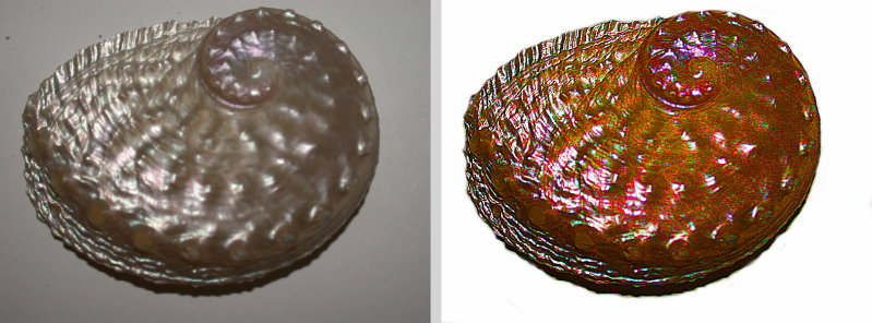
Sometimes just the right combination of modifications can enhance the image significantly. The following stitch shows the original abalone shell and the application of the focus algorithm, followed by painting in a white background, and then applying the “Color Replacement” function in the “Adjust” menu. These shells are very colorful and sometimes it is hard to preserve that and convey it in photographs. This one does, I think, do that without exaggerating or distorting the original shell’s appearance.
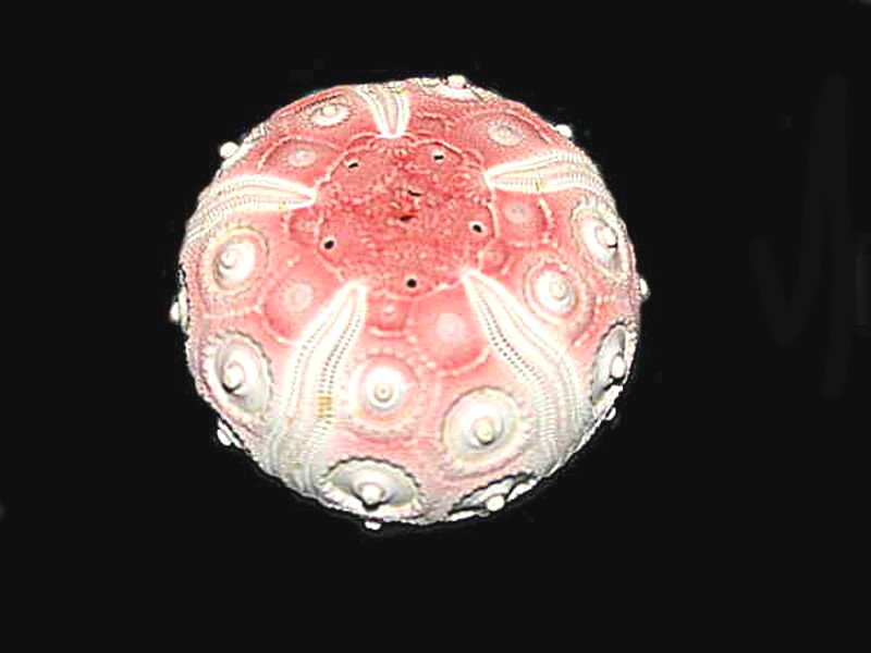
Another interesting function is that of the “Texture Filter” and it can provide some intriguing views with the right specimens. I want to try it out, this time on the test (“shell”) of the sea urchin, Stereocidaris grandis. First, the image without any alteration.
The texture filters present some intriguing possibilities in altering images for artistic purposes and I see no reason why there can’t be a marvelous blend of science and art. This one is “Creased Paper”.
The next one is rather fancifully titled “Stone”.
Now we get to something that might really appeal to those who like psychedelic images. The first one is “Plastic” and the second one is an “inverse” of it with a restoration of a black background.
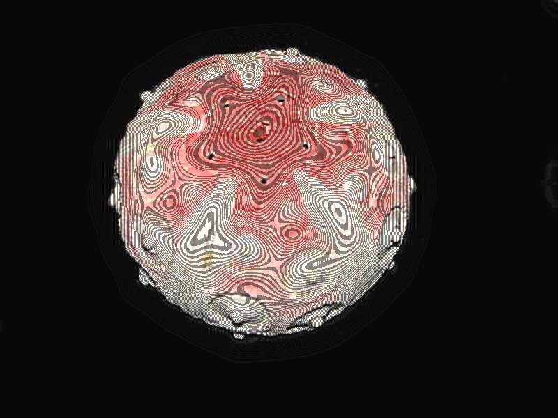
And finally one which I think gives quite fun results; it called the “Contour Line” function. It has an “animate” subfunction which rotates and moves things around on the surface of the object. I have just begun to play with that one, so I won’t inflict it on you here. So, the Contour Line image.
Well, enough fun for one session. I hope you did find a little something of interest. I plan to keep experimenting with other functions, so be prepared for yet another ramble.
All comments to the author Richard Howey
are
welcomed.
If email software is not linked to a browser, right click above link and use the copy email address feature to manually transfer.
Editor's note: Visit Richard Howey's new website at http://rhowey.googlepages.com/home where he plans to share aspects of his wide interests.
Microscopy UK Front
Page
Micscape
Magazine
Article
Library
Published in the June 2022 edition of Micscape Magazine.
Please report any Web problems or offer general comments to the Micscape Editor .
Micscape is the on-line monthly magazine of the Microscopy UK website at Microscopy-UK .
©
Onview.net Ltd, Microscopy-UK, and all contributors 1995
onwards. All rights reserved.
Main site is at
www.microscopy-uk.org.uk .